WEB: Ma vie amoureuse de marde
Here a little review of my work on the teaser of a web series I worked on last week. It’s not often I get to post a clip so quickly but we need some likes on it to get the money to actually produce the full season so here it goes.
The original idea comes from the Montreal humorist, Anne-Marie Dupras, who started to use her love life as an inspiration for web sketches. Martin Berardelli them approached her to produce a whole season of these funny clips. So he gathered a team to shoot this teaser.
The shoot
On set, DP Kevin Champagne Lessard was willing to shoot with his Sony FS100. As I knew we wouldn’t have much time to light the set, even though we ha a full set of 6 Dedo lights, I wanted to get the best image I could get from the camera. I borrowed a Sound Devices Pix240i from Sono-technique. This way I was able to record ProRes 422 HQ files instead of the AVCHD files of the FS100. The other nice surprise was that the Pix240i was able to remove the pulldown sequence from the 29.97 HDMI feed of the FS100 and record a native 23.98.
After a week of editing I got the final cut. It was easily conformed in Resolve since the data wrangling was so well done… by me. I usually use the Scene Cut detection tool for foreign projects but with such a short movie and possible changes along the way I thought it was safer this way.
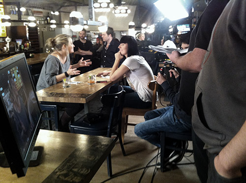
My FSI monitor showing the frame to the director and the DP. You can see the FS100 on the SHAPE rig with the Pix 240i and the Dedo lighting kit.
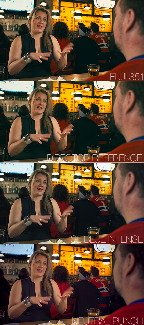
4 Looks to pitch
I first pitched 4 looks. The first one was to respond to the DPs demand: a film look. I used a dimmed Fuji 351 LUT that comes with Resolve 10. The result was a bit too harsh for the close ups on the actress.
The second proposition was to match a reference the director sent me of a very duotone clip from an American tv series shot outside. Our indoor scene wasn’t responding to this contrasty and greenish grade.
With the third one, I tried to use the Blue Intese LUT created by Looklabs thats integrated in Speedgrade and that I’ve converted to a Resolve LUT. It worked pretty well to cut the warm tungsten look of the shots but lacked in liveliness and came out a bit dull and desaturated.
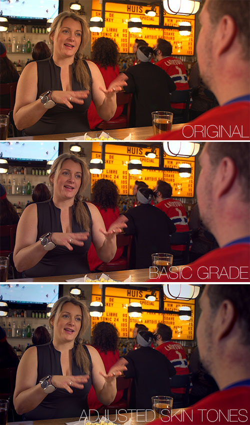
The forth proposition was a man-made look where I went and treated the skin tone apart from everything else. Here is a breakdown:
- Node 1: Basic balance to tame down the warm tungsten balance
- Node 2: Just a desat vignette for everything that surrounds the actress so that she pops out
- Node 3-4: Secondaries for the hard light hitting the guys and the table
- Node 4-5: Qualifier to select the skin tone, remove some red and add son spacial denoiser to smooth the skin
- Node 6: Hue vs Sat adjustments to work on hard colours like the red hockey jerseys and the yellow board
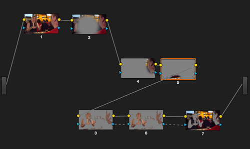
7 nodes fo a grade
Step 1-2-3
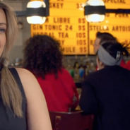
This looked was picked by the director are is was more forgiving on the skin and it gave more punch to the scenes of the web show that will have to fight screen estates with bright and colourful banners and websites. That was my pitch.
The grade
Once the look was approved, it was quite easy to go through the show. The lighting was quite constant. The only real variables were the clothes that were changing from scene to scene and the lens that was different depending if it was a close or wider shot. There was minor tracking on actors here and there but it was a quick grade.
The lesson
When you work on clients who don’t have a precise idea of what they want or need you often have to go in various directions and try many grades just to help them make an idea. The problem is that you can go on forever until you hit the right one. But, if you show your client too much versions and looks he will just become confused.
After that, we can discuss what we like in the various versions we have. What I usually do is go with their propositions and spend some time to match the references they send me. If I think there could be another way to work these images to serve the story better I also show the client my proposition. . If the client is in the grading room it is easy to be more interactive but if you send still via email, It’s easy to get confused. Always label you grabs according to the name or version of the grade.
If the client doesn’t fall in love right away with a proposition, he often tries to go half way or compromise between to very opposite direction which often give a less than perfect result. The key is to pitch your idea the right way, just like a ad agency would pitch a concept to a client. And this can only be achieved if you understand where the director wants to bring the viewer and how, with your grade, you can help him achieve that. The better you understand the scenes and the stronger the arguments, the less time you’ll spend working on in-betweens grades. If you are sure of your choice it will show and if you look confident the director and the DP will be more likely to go your way. But, even if you have to look convinced always respect the director’s choice. It’s its movie after all.
The result
Here is the teaser of Ma vie amoureuse de marde (My shitty love life). Enjoy and LIKE the clip please!
MA VIE AMOUREUSE DE MARDE – Teaser from Convictions films on Vimeo.
Follow the above link for the full credits.
Merci Mathieu pour l’article détaillé et les conseils. La question du pitch est particulièrement intéressante pour éviter les entre-deux pas trop assumés.